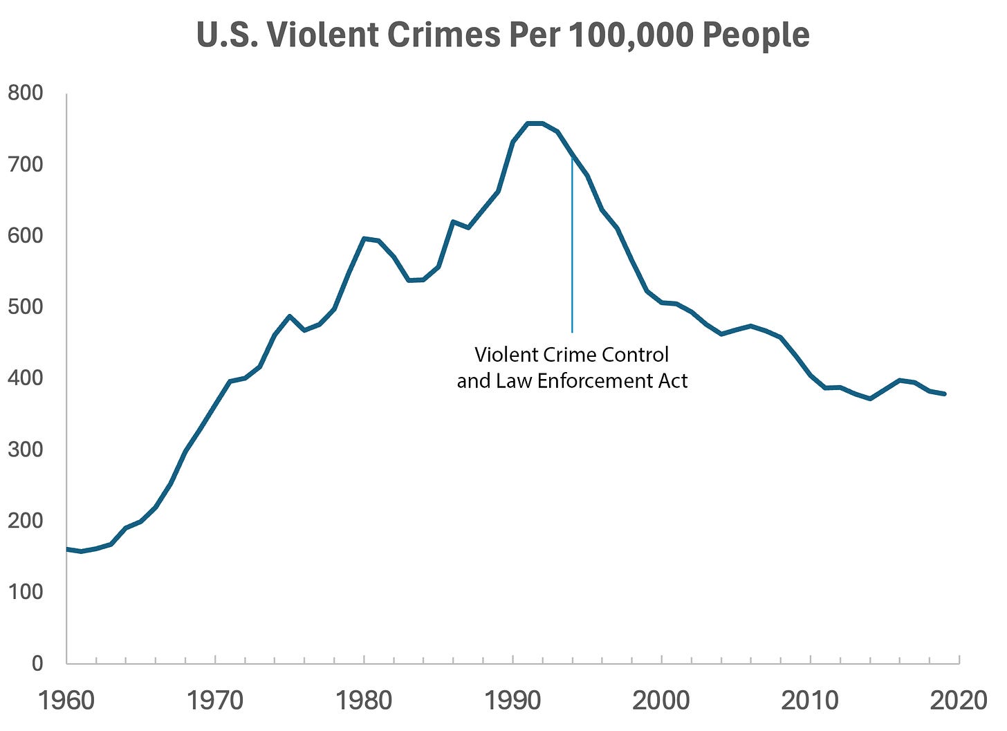
Column by Spencer Greenberg and Amber Dawn Ace: “In 1994, the U.S. Congress passed the largest crime bill in U.S. history, called the Violent Crime Control and Law Enforcement Act. The bill allocated billions of dollars to build more prisons and hire 100,000 new police officers, among other things. In the years following the bill’s passage, violent crime rates in the U.S. dropped drastically, from around 750 offenses per 100,000 people in 1990 to under 400 in 2018.

But can we infer, as this chart seems to ask us to, that the bill caused the drop in crime?
As it turns out, this chart wasn’t put together by sociologists or political scientists who’ve studied violent crime. Rather, we—a mathematician and a writer—devised it to make a point: Although charts seem to reflect reality, they often convey narratives that are misleading or entirely false.
Upon seeing that violent crime dipped after 1990, we looked up major events that happened right around that time—selecting one, the 1994 Crime Bill, and slapping it on the graph. There are other events we could have stuck on the graph just as easily that would likely have invited you to construct a completely different causal story. In other words, the bill and the data in the graph are real, but the story is manufactured.
Perhaps the 1994 Crime Bill really did cause the drop in violent crime, or perhaps the causality goes the other way: the spike in violent crime motivated politicians to pass the act in the first place. (Note that the act was passed slightly after the violent crime rate peaked!)
Charts are a concise way not only to show data but also to tell a story. Such stories, however, reflect the interpretations of a chart’s creators and are often accepted by the viewer without skepticism. As Noah Smith and many others have argued, charts contain hidden assumptions that can drastically change the story they tell…(More)”.