Stephanie Evergreen: “This post has been a long time coming. Ann Emery and I knew some time ago that evaluators and social scientists had a thirst for better graphs, a clear understanding of why better graphs were necessary, but they lacked efficient guidance on how, exactly, to make a graph better. Introducing the Data Visualization Checklist.
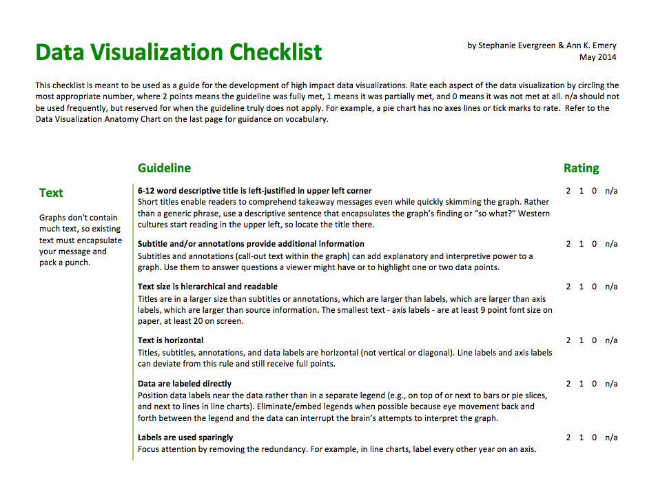
Download this checklist and refer to it when you are constructing your next data visualization so that what you produce rocks worlds. Use the checklist to gauge the effectiveness of graphs you’ve already made and adjust places where you don’t score full points. Make copies and slip them into your staff mailboxes.
What’s in the Checklist?
We compiled a set of best practices based on extensive research, tested against the practical day-to-day realities of evaluation practice and the pragmatic needs of our stakeholders. This guidance may not apply to other fields. In fact, we pilot-tested the checklist with a dozen data visualists and found that those who were not in a social science field found more areas of disagreement. That’s ok. Their dissemination purposes are different from ours. Their audiences are not our audiences. You, evaluator, will find clear guidelines on how to make the best use of a graph’s text, color, arrangement, and overall design. We also included a data visualization anatomy chart on the last page of the checklist to illustrate key concepts and point out terminology…”
Introducing the Data Visualization Checklist
How to contribute:
Did you come across – or create – a compelling project/report/book/app at the leading edge of innovation in governance?
Share it with us at info@thelivinglib.org so that we can add it to the Collection!
About the Curator
Get the latest news right in your inbox
Subscribe to curated findings and actionable knowledge from The Living Library, delivered to your inbox every Friday
Related articles
DATA
Privacy
The Data-Attention Imperative
Posted in June 23, 2026 by Stefaan Verhulst
Citizen Engagement
PEOPLE
Information Processing in Participatory Institutions
Posted in June 22, 2026 by Stefaan Verhulst
DATA
Data Collaboratives
Design and Implementation of Mobile Phone Data Initiatives
Posted in June 21, 2026 by Stefaan Verhulst