Article by Marie Patino: “…All of these dashboards were launched very early in the pandemic,” said Damir Ivankovic, a PhD student at the University of Amsterdam. “Some of them were developed literally overnight, or over three sleepless nights in certain countries.” With Ph.D. researcher Erica Barbazza, Ivankovic has been leading a set of studies about Covid-19 dashboards with a network of researchers. For an upcoming paper that’s still unpublished, the pair have talked to more than 30 government dashboard teams across Europe and Asia to better understand their dynamics and the political decisions at stake in their creation.
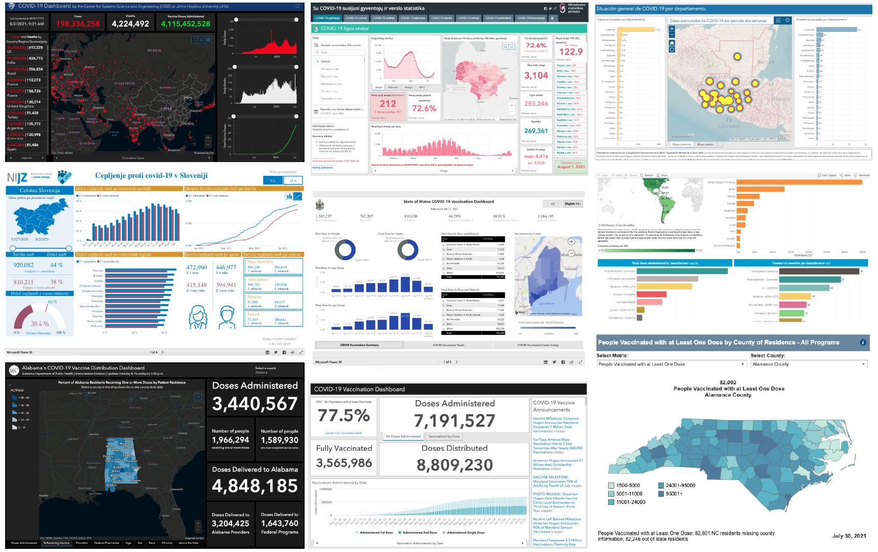
The dashboard craze can be traced back to Jan. 22, 2020, when graduate student Ensheng Dong, and Lauren Gardner, co-director of Johns Hopkins University’s Center for Systems Science and Engineering, launched the JHU interactive Covid dashboard. It would quickly achieve international fame, and screenshots of it started popping up in newspapers and on TV. The dashboard now racks up billions of daily hits. Soon after, cartography software company ESRI, through which the tool was made, spun off a variety of Covid resources and example dashboards, easy to customize and publish for those with a license. ESRI has provided about 5,000 organizations with a free license since the beginning of Covid.
That’s generated unprecedented traffic: The most-viewed public dashboards made using ESRI are all Covid-related, according to the company. The Johns Hopkins dash is number one. It made its data feed available for free, and now multiple other dashboards built by government and even news outlets, including Bloomberg, rely on Johns Hopkins to update their numbers.
Public Health England’s dashboard is designed and hand-coded from scratch. But because of the pandemic’s urgency, many government agencies that lacked expertise in data analysis and visualization turned to off-the-shelf business analytics software to build their dashboards. Among those is ESRI, but also Tableau and Microsoft Power BI.
The pros? They provide ready-to-use templates and modules, don’t necessitate programming knowledge, are fast and easy to publish and provide users with a technical lifeline. The cons? They don’t enable design, can look clunky and cluttered, provide little wiggle room in terms of explaining the data and are rarely mobile-friendly. Also, many don’t provide multi-language support or accessibility features, and some don’t enable users to access the raw data that powers the tool.