Lindsay Read and Tamar Manuelyan Atinc at Brookings: “There is a wide consensus among policymakers and practitioners that while access to education has improved significantly for many children in low- and middle-income countries, learning has not kept pace. A large amount of research that has attempted to pinpoint the reasons behind this quality deficit in education has revealed that providing extra resources such as textbooks, learning materials, and infrastructure is largely ineffective in improving learning outcomes at the system level without accompanying changes to the underlying structures of education service delivery and associated systems of accountability.
Stefaan Verhulst
Calestous Juma at Quartz: “…The first major impact of the technology on African users was to expand global connectivity by making it possible for the youth to access information that was collected using the technology via the Internet.
African engineers have been able use such information to design their own technologies suited to local condition. In 2016 Arthur Zhang, a young Cameroonian medical engineering was awarded the $37,000 Africa Prize for Engineering Innovation by the UK Royal Academy of Engineering. Zhang invented the Cardiopad, a tablet computer takes heart readings and sends them to a heart specialist using the Internet.
Zhang was trained in electronic engineering but gained much of the relevant medical knowledge by watching video online, many which had been posted using digital camera. Many more young Africans are following in Zhang footprints in using such material to acquire knowledge that is available through their regular university courses….
In agriculture, farmers can how take diseased images of the leaves of their crops and share them with scientists around the world for identification and advice. Such digital imaging research is an important addition to other agricultural used of mobile phones that constitute low-cost agricultural extension approaches.
Young African engineers are making extensive use of mobile phones for disease diagnosis. Ugandan researchers developed a jacket that diagnoses pneumonia faster than the standard methods used by doctors. Imaging technologies offer additional ways to expand the range of diagnosis for a wide range of diseases.
In low-cost eye are, for example, EyeNetra uses smartphones as a platform to capture the refractive power of the lenses in eyeglasses. EyeNetra is planning to deploy its technology in Nigeria. It has distributed units to be piloted in Gabon, Gambia, Kenya, Morocco, Rwanda, South Africa and Zimbabwe.
There have been concerns that the emerging era of personalized medicine will create a “health divide” between the industrialized and emerging worlds. This is mainly because of human genetic diversity influences the choice of treatment options. Smartphones are becoming as a low-cost way to pre-empt the emergence such a divide.
Climate change is going to force African scientists to study afresh alternations in the microscopic world. With as little as $15 Micro Phone Lens it will soon be possible to turn a regular smartphone into a microscope that capture images and videos at a magnification range of 15-60 times using the phone’s digital zoom feature. The add-on will inspire a new generation of explorers and scientists….(More)”
The tiny digital camera on every smartphone has had real impact on African lives
IDS Practice Paper by Francesca Feruglio and Ahmad Rifai: “In 2015, Yayasan Kota Kita (Our City Foundation), an Indonesian civil society organisation, applied to Making All Voices Count for a practitioner research and learning grant.
Kota Kita is an organisation of governance practitioners who focus on urban planning and citizen participation in the design and development of cities. Following several years of experience with participatory budgeting in Solo city, their research set out to examine participatory budgeting processes in six Indonesian cities, to inform their work – and the work of others – strengthening citizen participation in urban governance.
Their research looked at:
- the current status of participatory budgeting in six Indonesian cities
- the barriers and enablers to implementing participatory budgeting
- how government and CSOs can help make participatory budgeting more transparent, inclusive and impactful.This practice paper describes Kota Kita and its work in more detail, and reflects on the history and evolution of participatory budgeting in Indonesia. In doing so, it contextualises some of the findings of the research, and discusses their implications.
Key Themes in this Paper
- What are the risks and opportunities of institutionalising participation?
- How do access to information and use of new technologies have an impact onparticipation in budget planning processes?
- What does it take for participatory budgeting to be an empowering process for citizens?
- How can participatory budgeting include hard-to-reach citizens and accommodate different citizens’ needs? …(More)”.
Participatory budgeting in Indonesia: past, present and future
Hayley Tsukayama in the Washington Post: “President Trump may have used the power of social media to make his way into the White House, but now social media networks are showing that muscle can work for his opposition, too. Last week, more than 1 million marchers went to Washington and cities around the country — sparked by a Facebook post from one woman with no history of activism. This weekend, the Internet exploded again in discussion about Trump’s travel suspension order, and many used social media to get together and protest the decision.
Twitter said that more than 25 million tweets were sent about the order — as compared with 12 million about Trump’s inauguration. Facebook said that its users generated 151 million “likes, posts, comments and shares” related to the ban, less than the 208 million interactions generated about the inauguration. The companies didn’t reveal how many of those were aimed at organizing, but the social media calls to get people to protest are a testament to the power of these platforms to move people.
The real question, however, is whether this burgeoning new movement can avoid the fate of many so others kick-started by the power of social networks — only to find that it’s much harder to make political change than to make a popular hashtag….
Zeynep Tufekci, an associate professor at the University of North Carolina at Chapel Hill who has written a forthcoming book on the power and fragility of movements borne of social media, found in her research that the very ability for these movements to scale quickly is, in part, why they also can fall apart so quickly compared with traditional grass-roots campaigns….
Now, organizers can bypass the time it takes to build up the infrastructure for a massive march and all the publicity that comes with it. But that also means their high-profile movements skip some crucial organizing steps.
“Digitally networked movements look like the old movements. But by the time the civil rights movement had such a large march, they’d been working on [the issues] for 10 years — if not more,” Tufekci said. The months or even years spent discussing logistics, leafleting and building a coalition, she said, were crucial to the success of the civil rights movements. Other successful efforts, such as the Human Rights Campaign’s efforts to end the “don’t ask, don’t tell” policy against allowing gay people to serve openly in the military were also rooted in organization structures that had been developing and refining their demands for years to present a unified front. Movements organized over social networks often have more trouble jelling, she said, particularly if different factions air their differences on Facebook and Twitter, drawing attention to fractures in a movement….(More).”
It takes more than social media to make a social movement
Springwise: “CitySwipe is Downtown Santa Monica Inc’s opinion gathering app. The non-profit organization manages the center of the city and is using the app as part of the local government’s consultation on its Downtown Community Plan. The plan provides proposals for the area’s next 20 years of development and includes strategies for increased accessibility and affordable housing and improved public spaces.
The original plan had been to close the consultation period in early 2016 but in order to better reach and interact with as many locals as possible, the review was extended to early 2017. Like Tinder, users of the app swipe left or right depending on their views. Questions are either Yes or No or “Which do you prefer?” and each question is illustrated with a photo. There are 38 questions in total ranging from building design and public art to outdoor concerts and parking. Additional information is gathered by asking users to provide their location and preferred method of transport.
Mexico City recently conducted a city-wide consultation on its new constitution, and Oslo, Norway, is using an app to involve school children in redesigning safe public walkways and cycle paths….(More)”
Citizens give feedback on city development via Tinder-style app
Information is a key building block of a wide range of strategies that attempts to tackle weaknesses in service delivery and accountability at the school level, even where political systems disappoint at the national level. The dissemination of more and better quality information is expected to empower parents and communities to make better decisions in terms of their children’s schooling and to put pressure on school administrators and public officials for making changes that improve learning and learning environments. This theory of change underpins both social accountability and open data initiatives, which are designed to use information to enhance accountability and thereby influence education delivery.
This report seeks to extract insight into the nuanced relationship between information and accountability, drawing upon a vast literature on bottom-up efforts to improve service delivery, increase citizen engagement, and promote transparency, as well as case studies in Australia, Moldova, Pakistan, and the Philippines. In an effort to clarify processes and mechanisms behind information-based reforms in the education sector, this report also categorizes and evaluates recent impact evaluations according to the intensity of interventions and their target change agents—parents, teachers, school principals, and local officials. The idea here is not just to help clarify what works but why reforms work (or do not)….(More)”
Information for accountability: Transparency and citizen engagement for improved service delivery in education systems
Tobias Mirsch,Christiane Lehrer, and Reinhard Jung in Wirtschaftsinformatik: “Individuals make increasingly more decisions on screens, such as those on websites or mobile apps. However, the nature of screens and the vast amount of information available online make individuals particularly prone to deficient decisions. Digital nudging is an approach based on insights from behavioral economics that applies user interface (UI) design elements to affect the choices of users in digital environments. UI design elements include graphic design, specific content, wording or small features. To date, little is known about the psychological mechanisms that underlie digital nudging. To address this research gap, we conducted a systematic literature review and provide a comprehensive overview of relevant psychological effects and exemplary nudges in the physical and digital sphere. These insights serve as a valuable basis for researchers and practitioners that aim to study or design information systems and interventions that assist user decision making on screens….(More)”
Digital Nudging: Altering User Behavior in Digital Environments
Introduction to Special Issue of California Management Review by Boyd Cohen, Esteve Almirall, and Henry Chesbrough: “This article introduces the special issue on the increasing role of cities as a driver for (open) innovation and entrepreneurship. It frames the innovation space being cultivated by proactive cities. Drawing on the diverse papers selected in this special issue, this introduction explores a series of tensions that are emerging as innovators and entrepreneurs seek to engage with local governments and citizens in an effort to improve the quality of life and promote local economic growth…Urbanization, the democratization of innovation and technology, and collaboration are converging paradigms helping to drive entrepreneurship and innovation in urban areas around the globe. These three factors are converging to drive innovation and entrepreneurship in cities and have been referred to as the urbanpreneur spiral….(More)”
The City as a Lab: Open Innovation Meets the Collaborative Economy
Geo Developers Blog: “We are excited to announce that we are open-sourcing Google Earth Enterprise (GEE), the enterprise product that allows developers to build and host their own private maps and 3D globes. With this release, GEE Fusion, GEE Server, and GEE Portable Server source code (all 470,000+ lines!) will be published on GitHub under the Apache2 license in March.
Originally launched in 2006, Google Earth Enterprise provides customers the ability to build and host private, on-premise versions of Google Earth and Google Maps. In March 2015, we announced the deprecation of the product and the end of all sales. To provide ample time for customers to transition, we have provided a two year maintenance period ending on March 22, 2017. During this maintenance period, product updates have been regularly shipped and technical support has been available to licensed customers….
GCP is increasingly used as a source for geospatial data. Google’s Earth Engine has made available over a petabyte of raster datasets which are readily accessible and available to the public on Google Cloud Storage. Additionally, Google uses Cloud Storage to provide data to customers who purchase Google Imagerytoday. Having access to massive amounts of geospatial data, on the same platform as your flexible compute and storage, makes generating high quality Google Earth Enterprise Databases and Portables easier and faster than ever.
We will be sharing a series of white papers and other technical resources to make it as frictionless as possible to get open source GEE up and running on Google Cloud Platform. We are excited about the possibilities that open-sourcing enables, and we trust this is good news for our community. We will be sharing more information when we launch the code in March on GitHub. For general product information, visit the Google Earth Enterprise Help Center. Review the essential and advanced training for how to use Google Earth Enterprise, or learn more about the benefits of Google Cloud Platform….(More)”
Open-Sourcing Google Earth Enterprise
The Pew Charitable Trusts: “Evidence-based policymaking is the systematic use of findings from program evaluations and outcome analyses (“evidence”) to guide government policy and funding decisions. By focusing limited resources on public services and programs that have been shown to produce positive results, governments can expand their investments in more cost-effective options, consider reducing funding for ineffective programs, and improve the outcomes of services funded by taxpayer dollars.
While the term “evidence-based policymaking” is growing in popularity in state capitols, there is limited information about the extent to which states employ the approach. This report seeks to address this gap by: 1) identifying six distinct actions that states can use to incorporate research findings into their decisions, 2) assessing the prevalence and level of these actions within four human service policy areas across 50 states and the District of Columbia, and 3) categorizing each state based on the final results….
Although many states are embracing evidence-based policymaking, leaders often face challenges in embedding this approach into the decision-making process of state and local governments. This report identifies how staff and stakeholder education, strong data infrastructure, and analytical and technical capacity can help leaders build and sustain support for this work and achieve better outcomes for their communities.
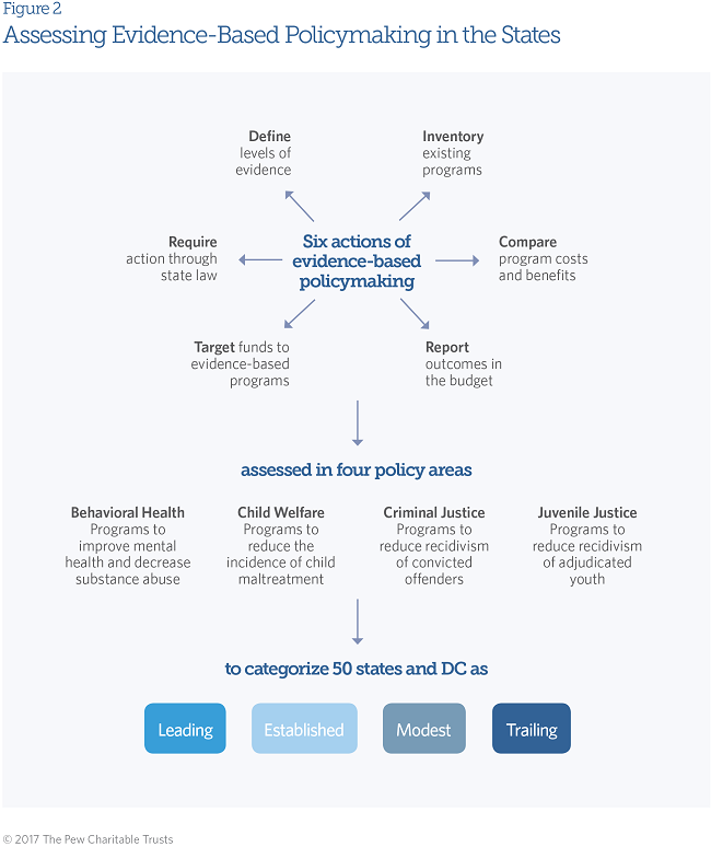
How States Engage in Evidence-Based Policymaking
Saurabh Tyagi at Sustainable Brands: “Everything around us is impacted by big data today. The phenomenon took shape earlier in this decade and there are now a growing number of compelling ways in which big data analytics is being applied to solve real-world problems….Out of the many promises of big data, environment sustainability is one of the most important ones to implement and maintain. Why so?
Climate change has moved to the top of the list of global risks, affecting every country and disrupting economies. While a major part of this damage is irreversible, it is still possible with use of a wide range of technological measures to control the global increase in temperature. Big data can generate useful insights that can be as relevant towards fostering environment sustainability as they have been to other sectors such as healthcare.
Understanding operations
Big data’s usefulness is in its ability to help businesses understand and act on the environmental impacts of their operations. Some of these are within their boundaries while others are outside their direct control. Previously, this information was dispersed across different formats, locations and sites. However, now businesses are trying to make out the end-to-end impact of their operations throughout the value chain. This includes things that are outside of their direct control, including raw material sourcing, employee travels, product disposal, and the like.
Assessing environmental risks
Big data is also useful in assessing environmental risks. For example, Aqueduct is an interactive water-risk mapping tool from the World Resources Institute that monitors and calculates water risk anywhere in the world based on various parameters related to the water’s quantity, quality and other changing regulatory issue in that area. With this free online, users can choose the factors on which they want to focus and also zoom in at a particular location.
Big data is also enabling environmental sustainability by helping us to understand the demand for energy and food as the world population increases and climate change reduces these resources by every passing year.
Optimizing resource usage
Another big contribution of big data to the corporate world is its ability to help them optimize usage of resources. At the Initiative for Global Environment Leadership (IGEL) conference in 2014, David Parker, VP of Big Data for SAP, discussed how Italian tire company Pirelli uses SAP’s big data management system, HANA, to optimize its inventory. The company uses data generated by sensors in its tires globally to reduce waste, increase profits and reduce the number of defective tires going to landfills, thus doing its bit for environment. Similarly, Dutch energy company Alliander uses HANA to maintain the grid’s peak efficiency, which in turn increases profits and reduces environmental impact. While at one time it used to take 10 weeks for the company to optimize the grid, now it takes only three days to accomplish the same; a task which Alliander used to do once in a year now can be accomplished once every month….
Big data helps better regulation
Big data can also be integrated into government policies to ensure better environmental regulation. Governments can now implement the latest sensor technology and adopt real-time reporting of environmental quality data. This data can be used monitor the emissions of large utility facilities and if required put some regulatory framework in place to regularize the emissions. The firms are given complete freedom to experiment and chose the best possible mean of achieving the required result….(More)”
What Does Big Data Mean For Sustainability?