Antonio Salazar at BBVA Open Mind: “…A good infographic can save lives. Or almost, like the map drawn by Dr. Snow, who in 1854 tried to prove —with not much success, it’s true— that cholera spread by water. Not all graphics can be so ambitious, but when they hope to become a very powerful vehicle for knowledge, these are three elements that an excellent infographic should have. In order:
1. Rigor
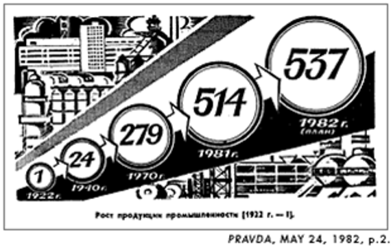
This is taken for granted. Or not. This chart from Pravda (not Miuccia, the Soviet daily) is manipulated graphically to give the impression of growth:
But rigor does not only mean accuracy, it means respect for the data in a broader sense. Letting them speak beyond the ornamentation, avoiding the “ducks” referred to by Edward R. Tufte. Guiding our eye so the reader can discover them one step at a time. This brings us to the second quality:
2. Depth
The beauty of the data sometimes lies in their implications and their connections. This is why a good infographic should be understandable at first sight, but also, when viewed for a second time, enable the reader to take pleasure in the data. Perhaps in the process of reasoning, both analytical and visual, that a graphic requires, we may come to a conclusion we hadn’t imagined. This is why a good infographic should have layers of information. Any infographic by Francesco Franchi is a wonder of visual richness and provides hours of entertainment and learning.
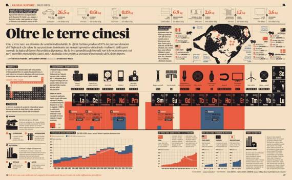
Infographic by Francesco Franchi and Alessandro Giberti on Chinese imports published in IL
3. Narration
Storytelling in today’s parlance. When time, space and even meteorology are combined skillfully to tell a story through the data….”