Ben Paynter at Fast Company: “…It’s an idea that’s hard to visualize unless you can see it on a map. So MIT Media Lab collaborated with the location intelligence firm Cuebiqto build one. The result is called the Atlas of Inequality and harvests the anonymized location data from 150,000 people who opted
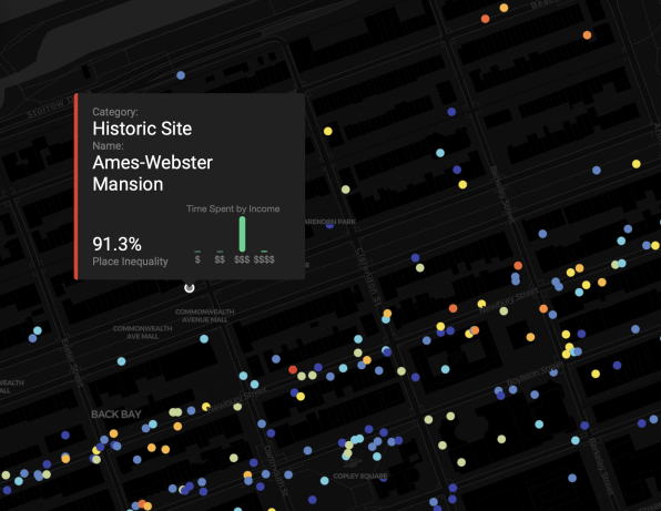
The result is an interactive view of just how filtered, sheltered, or sequestered many people’s lives really are. That’s an important thing to be reminded of at a time when the U.S. feels increasingly ideologically and economically divided. “Economic inequality isn’t just limited to neighborhoods, it’s part of the places you visit every day,” the researchers say in a mission statement about the Atlas….(More)”.