Google blog: “…The U.S. Census is one of the largest data sets journalists can access. It has layers and layers of important data that can help reporters tell detailed stories about their own communities. But the challenge is sorting through that data and visualizing it in a way that helps readers understand trends and the bigger picture.
Today we’re launching a new tool to help reporters dig through all that data to find stories and embed visualizations on their sites. The Census Mapper project is an embeddable map that displays Census data at the national, state and county level, as well as census tracts. It was produced in partnership with Pitch Interactive and Big Local News, as part of the 2020 Census Co-op (supported by the Google News Initiative and in cooperation with the JSK Journalism Fellowships).
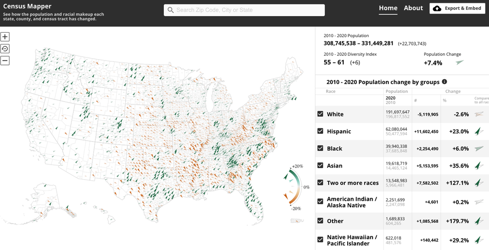
Census Mapper shows where populations have grown over time.
The Census data is pulled from the data collected and processed by The Associated Press, one of the Census Co-op partners. Census Mapper then lets local journalists easily embed maps showing population change at any level, helping them tell powerful stories in a more visual way about their communities.
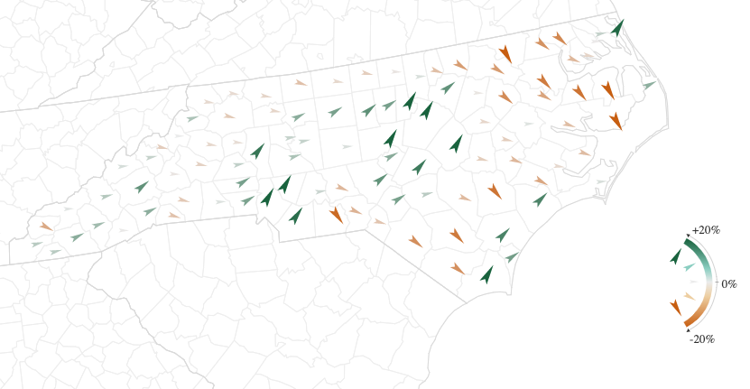
With the tool, you can zoom into states and below, such as North Carolina, shown here.
As part of our investment in data journalism we’re also making improvements to our Common Knowledge Project, a data explorer and visual journalism project to allow US journalists to explore local data. Built with journalists for journalists, the new version of Common Knowledge integrates journalist feedback and new features including geographic comparisons, new charts and visuals…(More)”.